Welcome

This is the newly setup blog to split up the creative process of my film I have up my sleeve for my MA and currently working towards. It will hopefully be updated regulary, the old posts will get updated as the designing of the film continues. As the design stage phase closes, this'll probably have thumbnails, storyboards, animatics and linetests to detail the film coming into existence more and more.
If you look to the right of this text, you'll find a summary of posts of the project carried out so far to date for easy navigation, underneath that is what I've been looking at in order to design the film's look and general inspiration.

Tuesday 23 February 2010

Inspiration #7: Bold Package Design

http://johnkstuff.blogspot.com/2010/02/bold-package-design.html

John K has some GREAT examples of retro packaging design and do you know what? He's right, the sweet packets at the bottom, although a lot more colourful, just look damn right awful especially the 'Angelica from Rugrats gone wrong'.

I'm sorry, I just can't be bothered posting separate pics, just have to visit the link on John K's blog.

Sunday 21 February 2010

Inspiration #6: Music Video


My Friend Naz just sent this, saying it reminds him of my project. Interesting, using this as reference for the film, the rainbow stuff in this is great.

Tale of the digraced canvas


Take 1 A3 canvas, a paintbrush and a box full of 20 travel acrylic paints.


Instant buggered up canvas, well, all I can say, is that it's a good thing I decided to take pictures with the digital camera and I also learnt, not all my experimental concept art will go to plan.

Saturday 20 February 2010

Paper Skyline

I'm posting this as I do it because I'm afraid I might ruin something on the next layer. I'm not sure why I'm doing this in a sketchbook, but it seems like a good idea at this time. Instead of wasting a canvas with paper. The last 'making of' the canvas turned out pretty good to look back on.


Irfanview Autoadjust. Looks funky!

Negative of the above adjusted pic.
Me messing around with light colour options and contrast, this is starting to look very good.
Eerie. Perhaps the doomed city as the floods continue.


EDIT:21/FEB/10
Got around to doing this by putting the original image of the finished paper skyline in Flash and drawing over as I would with a marker. Just didn't want to ruin the original sketchbook collage. I don't really think it looks as good. The graphics pen doesn't seem to be accurate enough.

Friday 19 February 2010

Machinery in animation/illustration


Bear that wasn't. WB animation directed by Chuck Jones. Caps taken from Shane Glines' blog.

Both of these illustrations are made by an professional illustrator called Gierdre Domaite an artists that I found in an issue of Creative Arts Projects.

Skyline Canvas Concept Art

Today I decided to incite a terrible act against 99p acquired canvas. I tried to paint on it.

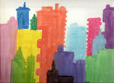
This is the result of about 3 layers of each colour in (also cheap bought) watercolours with a brush with cheap hair which kept on falling out as I used it. This is not the finished painting. This is also the first time I've ever scanned a canvas, which felt odd and then I had to colour correct the picture with my best freeware image tool in the world that I couldn't do without; Irfanview.

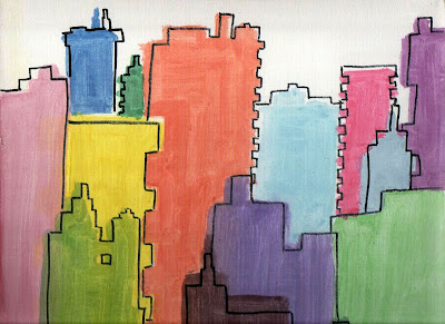
This is the 'shifted outline' ink stage of it. Nearly every building was given a different amount and position of 'shifting'. The picture looks better already if you ask me. Looks very 'impressionist'. I'm sure someone could get/has gotten rich doing simple things like this.
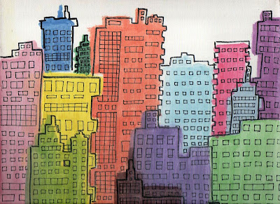
I like the light green building with the gap. Some very different shapes used for this.

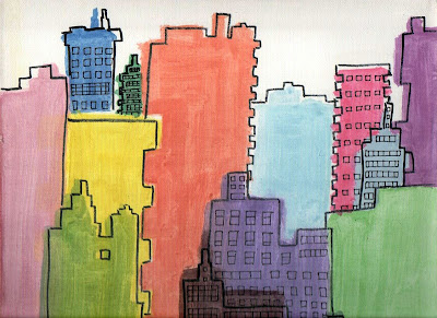
I started adding the little details keeping the windows inside the outline. Doing the 'easy' buildings first.

I started alternating patterns of windows to make the buildings all look interesting and have a different 'personality', my painting was beginning to shape up now.

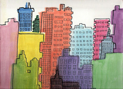
And so, this is the finished painting. Not a bad piece of concept art. I guess the logical thing to do from this point would be to mess about with it with computer software and see what can come out of it. Who knows, you may even see parts of the painting in the finished animation.

It was quite nice to experiment on canvas again, as I hadn't done it for years, hopefully, if the next ideas of paintings shape up, you'll see more.

Modern architecture?

I've been looking at my work so far, relating to the city sequence and something is very wrong. I'm still designing a 1950s metropolis. Which isn't what I want to be doing, what I DO want to be DOING is dragging that particular style into the 2000's kicking and screaming.

Based on one of my friends uploaded photos of London on Facebook, I realised this is the kind of thing that I'd been missing. So I did a quick sketch and a test to see if it fit in with the 'shifted outline' look.

I don't think the conversion to block colour and line worked. Never one to give up easily, I persevered further with this idea as this kind of this modern electronic screen billboard and it was the kind of thing which was missing to make my animation seem more modern.
If anyone's curious, the boards say 'Pure Rainbow' in a faux 'Coca-Cola' look, 'Thing' and 'Vague'.

Here is the block colour version, done with felt-tip and marker. It's suggestible, but not quite clear what you're looking at.


Then I found out that this doesn't seem to work at all, which is a shame. The building on the right does, the left building just looks like a confused mess. 'Shame 'bout that.